Practical Learning Activity
Skills

Practical
Take notes and answer questions as you read and learn.
Statistics and Data
Statistics are, generally speaking, the groups of values which are collected for the purpose of meaningful research and historical records. Data is the assembled numbers, values and details which have been collected.
Probability
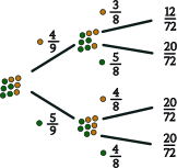
Probability assesses the likelihood of an even occurring or being in existence. An example of how we can show probability is through a tree diagram (see below).
Types of Statistics and Data Tools With Examples
Graphs, Charts and Plots
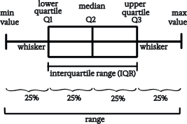
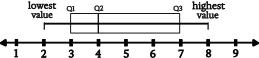
There are many tools that are useful in statistics because they present the data in a visual way that makes it easier to understand, interpret and work with than raw data. Many types of graphs, charts, diagrams and plots are used to present data, including line graphs, bar graphs, histograms, pie charts, Venn diagrams, tree diagrams, scatter plots, box plots, time series plots and frequency distribution tables. Many graphs are presented on a Cartesian plane with x and y coordinates on the horizontal and vertical axes respectively.
Line Graphs
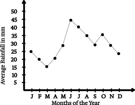
Line graphs use a line to represent the change in a variable in data over time or in relation to another variable. In the example shown, the average monthly rainfall (in mm) is shown on the vertical y-axis of the graph and the months of the year are shown on the horizontal x-axis.
Bar Graphs
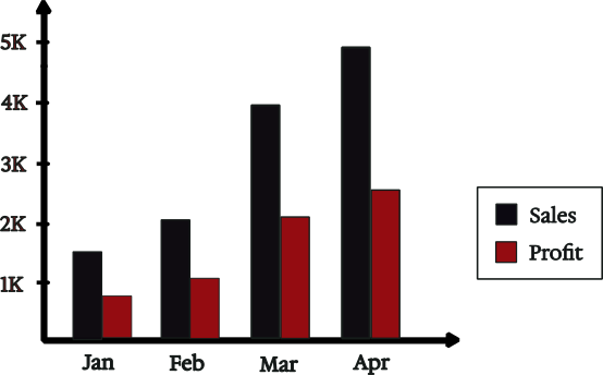
A bar graph visually displays data using bars of equal width, where the height or length of the bars indicates the value of the data variable. This format makes it easy to compare different categories or time periods at a glance. In the example shown, we see a comparison of Sales and Profit. This visual representation of four months’ worth of data allows the monthly totals to be compared quickly and easily.
Histograms
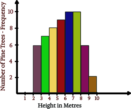
Unlike the bars in bar graphs, the bars in histograms are joined together to show continuous data. The width of the bars represents the class intervals, and the x-axis values ascend continuously from lowest to highest. This example of a histogram shows the growth of 58 pine trees over 10 years. The number of pine trees is shown on the vertical y-axis, and the height attained by the pine trees after 10 years of growth is shown on the horizontal x-axis.
Pie Charts
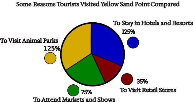
Pie charts show a clear pictorial representation of the percentages of different variables within a topic of interest. Here we can see that the topic is ‘Some Reasons Tourists Visit Yellow Sands Point Compared.’ Four reasons are represented along with their respective percentages.
Make your own Pie Chart (Activity)
Choose your topic and categories. Write down three to five categories which are in the topic that you choose. The topic could be your favourite sports, collectables you own, or your preferred fruits. Think about your topic to see if you could make a meaningful pie chart from it. If not, try a different topic.
Determine your data values. What will the reason for your chart be? How will you divide the pie up into slices? For instance, if you have chosen fruit, you might want to make the heading of your pie chart, ‘Most Preferred Fruit,’ and then rate the fruit in percentages according to how much you prefer each one. Or, if you have chosen sports, you may wish to compare the hours spent playing each sport each week, and calculate your percentages that way. Or, if you have chosen a collectable, you may wish to determine your percentages on the basis of the amounts of the different types of collectables you have.
Calculate your percentages. Calculate and write down the percentage each of your categories will take up in the pie.
Convert to degrees. To convert the percentages into angles, multiply each of them by 3.6 to get a figure out of 360°.
Draft a rough copy. With a pencil, draw a circle and mark a centre point in the circle and use a protractor to measure and plot out the angles which you just calculated. Draw lines from the central point of the circle so that the lines divide the circle into slices for each of your categories. Write the names of your categories outside the circle. Check that your calculation for each category is correct. Add up your angles to ensure they total 360°.
Draw the final chart. When you are happy with how your ‘rough copy’ looks, start drawing the final version by drawing over the pencil with coloured pens.
Add colour and labels. Draw in the different coloured lines around each category’s slice. If you prefer not to colour in the categories, you can draw lines with a ruler at regular intervals (in the colour of each area) across each of the slices to make stripes. Do not forget to make a key which shows what each of the categories are called, along with their colours (refer to the pie chart above). Give the pie chart a heading that sums up the topic and reason that you have chosen to make the pie chart. Put your pie chart in a book or fix it onto a wall display where you keep your best work.
Venn Diagrams
John Venn (1834-1923) promoted this type of diagram to represent sets and to show set relationships from about 1880 onwards. The information within the rectangle is called a universal set and within the rectangle each of the circles represent a set. The convention is to list the elements within a set in {} braces or curly brackets. A set could state numbers like S = { 1, 2, 3, 4, 5 } or a description such as S = { whole numbers from one to five }. The list of elements or description should be well-defined. This means that it must be based on objective facts rather than on subjective opinions which are arguable. A set should be able to be interpreted in only one way. If two sets contain the same elements or objects they are called equal. For instance { whole numbers from 1 to 5 } = { 1, 2, 3, 4, 5 }. The Venn Diagram can also be used to show things or events.
- 2 ∈ S means 2 is an element of set S.
- 6 ∉ S means 6 is not an element of set S. | S | is the symbol for the number of elements in the set. If S = { 1, 2, 3, 4, 5 }, then | S | = 5.
- n(S) is the symbol for the number of elements in a set. If S = {1, 2, 3, 4, 5}, then n(S) = 5.
- A set with no elements is indicated by this symbol ∅.
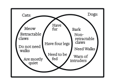
∩ is a symbol which represents intersection. If circle one is A and circle two is B, where the circles intersect, the shared elements or events between A = {Meow, Retractable claws, Do not need walks, Are mostly quiet, Have fur, Have four legs, Need to be fed} and B = {Have fur, Have four legs, Need to be fed, Bark, Non-retractable claws, Need walks, Warn of intruders} can be shown as (A ∩ B) = {Have fur, Have four legs, Need to be fed, }. The symbol for union ∪ is used to show where all elements in both sets are shown, but only once. For example, (A ∪ B) = {Meow, Retractable claws, Do not need walks, Are mostly quiet, Have fur, Have four legs, Need to be fed, Bark, Non-retractable claws, Need walks, Warn of intruders},
Probability Tree Diagrams
Probability is expressed as a fraction, percentage or decimal between 0 and 1. This example of a probability tree diagram shows the likelihood of an orange or green ball being chosen by chance, in two separate choices, when the balls are not replaced after the first choice. In the first choice, the likelihood of an orange ball being chosen is P (O) = 4/9 and the likelihood of a green ball being chosen is s P (G) = 5/9. After the first choice, the number of balls is reduced to eight, and therefore the fractions’ denominators are reduced to eighths. The two fractions of the first and second choice are multiplied to give the answers at the far right of the probability tree diagram. These figures represent the total likelihood of getting the string of outcomes represented in each case.
Answer the following questions relating to the tree diagram shown.
Show Answer
$$P\; (O) \;= \;\frac{3}{8}$$
Show Answer
$$P\; (O) \;= \;\frac{4}{8}\;=\;\frac{1}{2}$$
Show Answer
$$P\; (OG) \;= \;\frac{5}{18}$$
Show Answer
$$P\; (OO) \;= \;\frac{1}{6}$$
Show Answer
$$P\; (OG)\;\frac{5}{18} \;+\; P\; (GG)\;\frac{5}{18}\;= \;\frac{5}{9}$$
Scatter Plots
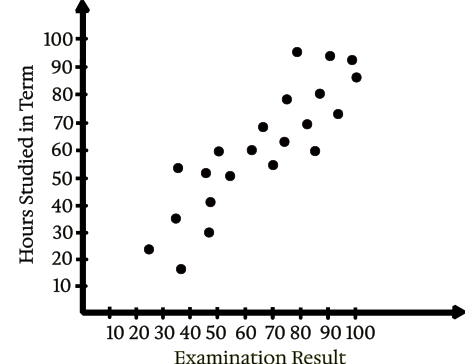
A scatter plot can show you whether there is a correlation or relationship between two variables. In the example given, we can see there is a strong positive correlation between the number of hours students studied in the term and their examination results. We know this because the data points (dots) are closely grouped together and show a clear upward trend. If the dots were very widely scattered, we would say there is little or no correlation between the two variables being considered.